But how could one not be curious about a call for submissions piece that must be destroyed to be fully understood? Or art show catalogs that unite to form a vibrant sculpture, ideal for a window display?
In the past year alone, Espiritu and his studio “gdloft” have generated numerous awards and positive reviews in design's most prestigious venues, including STEP Magazine, PRINT Magazine, Communication Arts, and the Cooper Hewitt/Smithsonian National Design Museum to name a few.
With offices in Philadelphia, Los Angeles, and Korea, gdloft is a collaboration with two of Espiritu’s graduate school friends from the Yale School of Art.
No doubt 2009 has been good to the studio. In fact, Gordon Kaye, editor of Graphic Design USA, credits gdloft for producing one of the best projects this year.
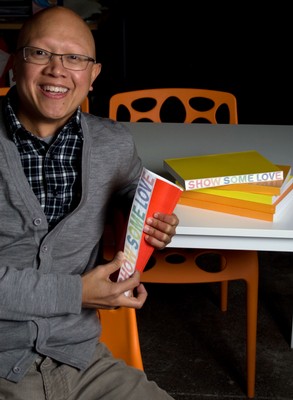
That project, which Kaye refers to here, is a catalog Espiritu was asked to create for a winners’ exhibition for the 2009 Philadelphia Design Awards (PDA). The concept for this piece emerged from his questioning whether graphic design should even be displayed in a space typically reserved for traditional art.
“I don’t view graphic design as art,” notes the 1993 Rutgers–Camden graduate. “Hanging a painting on a white wall makes sense. Graphic design is supposed to interact with the world.”

While a work of art is special because it is intentionally distinct, Espiritu muses that graphic design exists primarily to be copied a million times over. Each catalog for this show however, all 576 of them – a number chosen to represent the total number of submissions – would be unique.
Utilizing variable data technology, typically used by direct marketers to customize pieces within the same production line, each of Espiritu's catalogs were printed 1% differently in color. The full collection completes the ROYGVIB spectrum and makes a striking conversation piece on display or in one’s hands. “Let’s just say my printer is scared of me,” jokes Espiritu.
Even more fun, the cover’s only text, “Show Some Love,” – a play on another understanding of the organization's acronym PDA, namely public display of affection, – is emphasized when the edge of the catalog is physically bent.
Assignments in Espiritu’s courses include listing words that describe animals, then handing those lists to an unsuspecting student who then makes symbols based on those words.
“They have no idea what the next step is. It’s completely a reactionary process,” he notes. “If you know what the end is, you’ll get preconceived notions of what it should be and you can’t enjoy the process.”
This strategy has proven successful for his students, who are also cultivating their own share of awards. Some recent standouts include, Lucy Price, whose work was featured in the international design journal CMYK; Christian Mortlock, who won the Excellence in Digital Media Student Award from the International Digital Media and Arts Association, and William Engles who won best of category book design at the Fifth Annual Student Show and Conference in 2009.
While his students are creating winning works, Espiritu believes that it’s often more helpful when a student’s work isn’t immediately successful. That struggle can ignite more meaningfully the creative process.
“What I really teach is failure in graphic design,” Espiritu offers. “If you fail, we can have a real conversation. And to be creative, you must begin by failing.”
Media Contact: Cathy K. Donovan
(856) 225-6627
E-mail: catkarm@camden.rutgers.edu